CASE FILE :: 01/19
htm@portfolio:~$ cat swich
01 / 19
S'WICH

S'WICH

A hospitality brand that needed to live on a Coles shelf AND feel like a corner-shop favourite at the same time.

Restraint is the brand. Strip the menu, lean the palette, let the produce do the talking.

Year2020 to presentSectorHospitalityRoleBrand + Packaging + Campaign
Jump to artboards

Challenge

S'WICH began with a basic logo, a colour palette, and a wordmark. The job was to make all of it hold together across menus, packaging, and the digital surface, while keeping the brand alive in a saturated café market.

Artboards · selected work

S'WICH01 / 16
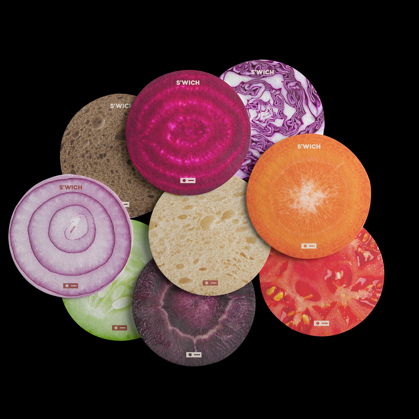
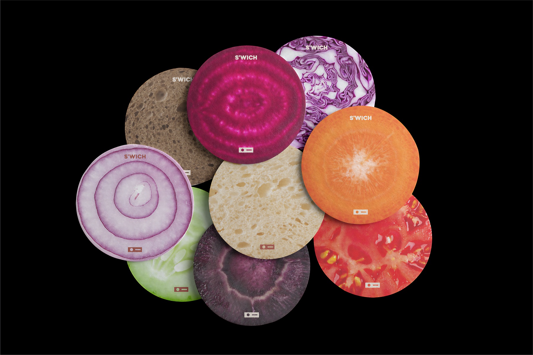
Produce coasters · launch hero
01
Produce coasters · launch hero
01 / 16

Solutions

  • Built a cohesive identity stretching from print to product
  • Designed produce-coaster artwork as the launch hero
  • Optimised the menu for upsells without losing the brand voice

Results · in numbers

6
Branded deliverables, menu boards to olive-oil packaging
v3
Animated menu boards iterated to version three
1st
Best Café Design · 2023
5+ yr
Brand actively iterating since 2020 launch

Brand system

Palette
/01
Beetroot
/02
Carrot
/03
Lettuce
/04
Cabbage
/05
Egg Yolk
/06
Brown Paper
Nate became instrumental not just in shaping our design but in guiding our overall strategy. Every element has been carefully thought through and elevated under his direction.
J. Abrams, Founder · S'WICH